This is an archived version of the article. For the latest edited version, visit Orchidea Journal
Hiya! Here’s your monthly Orchidea Agency Newsletter — packed with business insights, practical tips, and visual inspiration to help beauty and wellness brands shine.
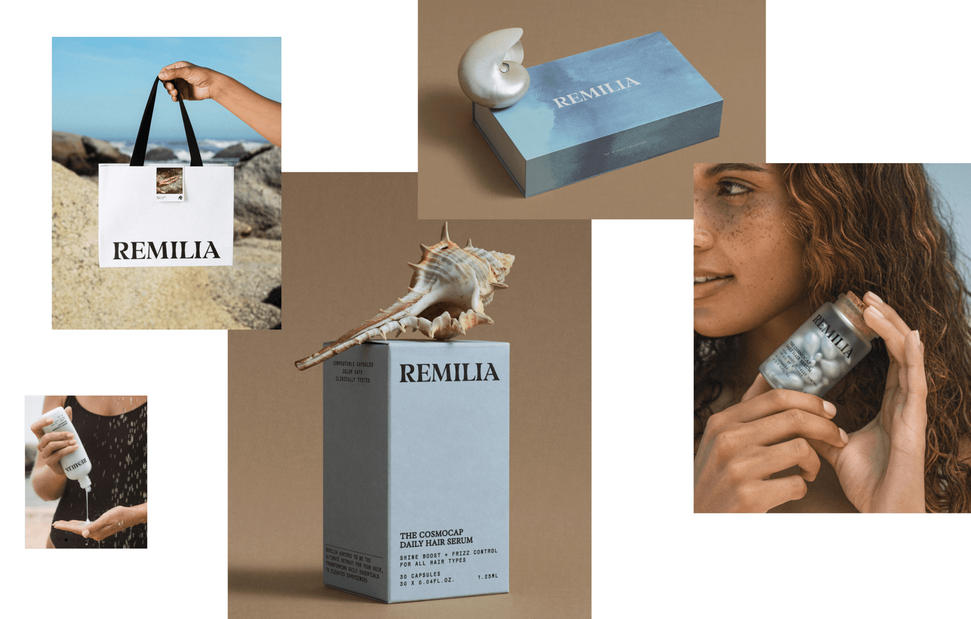
When an indie beauty brand finds itself blending in instead of standing out, it’s time for a makeover. Remilia Hair – a company known for its innovative single-use hair serum capsules, realized that while their product was a hit, their brand identity had become just another face in the “clean beauty” crowd.
So, they embarked on a bold rebranding journey (together with our team) and came out the other side with more than just a prettier logo. Result is +69% jump in average order value, and +44% conversion rate. Three major retailers signed right after Cosmoprof event.
Yes — fonts and colors did that. Or rather, the right fonts and colors, in the hands of professionals.
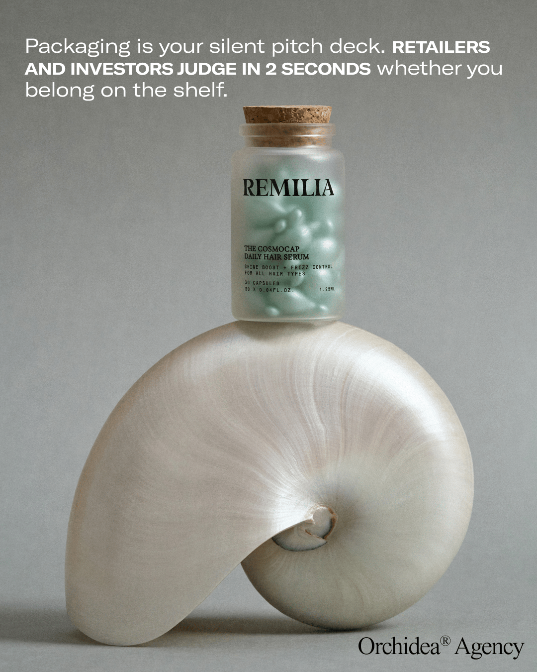
Along the way, we picked up a few hard truths about rebranding — the kind that make founders sweat, investors nod, and designers argue. Served with a side of sarcasm (because who wants another “5 tips for rebranding” article), here are five candid lessons from Remilia’s glow-up:
KNOW WHEN YOUR IDENTITY
NO LONGER MATCHES YOUR AMBITION

Post-rebrand, the packaging feels alive: exquisite, elegant, elevated.
Remilia had a product consumers adored, but its branding was too comfortably lodged in the indie clean-beauty niche. In fact, the brand’s style was so safe and familiar that it risked blending into the crowded market.
⬜️ LOOKS GOOD, BUT SAYS NOTHING
If your branding could be swapped with three competitors and no one would notice, you don’t have an identity — you have wallpaper. Pretty fonts and nice packaging won’t cut through if they don’t say something only you could say.
→ Design without a point of view is just noise.

⬜️ CONSUMERS LOVE THE PRODUCT, CAN’T REMEMBER THE BRAND
People talk about how amazing your product is… and then forget your name. That’s a classic mismatch. Recognition matters — if the logo isn’t clear, the packaging isn’t distinct, or your story isn’t sticky, you’re bleeding equity.
→ If they can’t recall you, they can’t re-buy you.

PROTECT WHAT’S ICONIC,
EVOLVE WHAT’S LIMITING
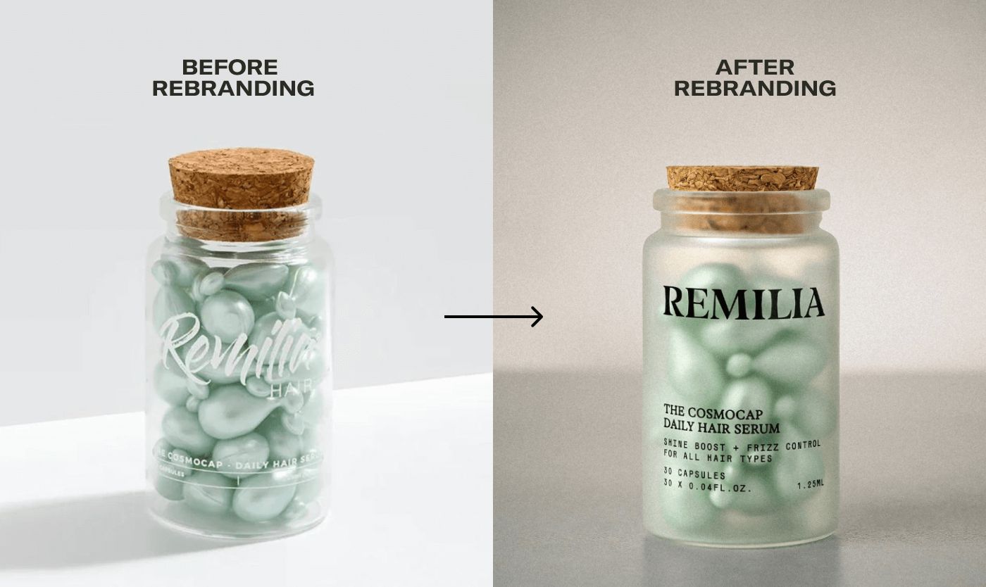
After rebrand, the packaging became more readable = more memorable.
When we took on Remilia’s rebrand, one element was sacred: those little cork-capped packaging element – the brand’s signature packaging. We weren’t about to mess with that piece of iconography (non-negotiable!). Everything else, however, was fair game for an upgrade.
◻️ REFRESH POSITIONING: FROM OCCASIONAL USE TO DAILY RITUAL
Together with the client and our brand strategist, we shifted Remilia from a travel-oriented positioning to an emotionally driven brand platform: the feeling of a retreat in your own bathroom. It turns professional hair care into an at-home ritual people can feel every day. This platform is a strong, expandable universe that supports future narratives, product launches, and communications.
→ Build a brand that drives repeat purchases, not one-off buys.

The emotion we want to evoke in customers
In any rebrand, figure out what makes your brand uniquely you (and keep it), then give a stylish makeover to the rest. Don’t throw the cork out with the bottle, preserve the good stuff and boldly reinvent the things that aren’t working.
EXPECT ITERATIONS
(AND EMBRACE THE FEAR)

Logotype options we explored
Here’s a not-so-secret secret: rebranding is scary for founders. At the start, everyone tends to cling to the “safe” option – the familiar logo, the comfy color palette – like a security blanket. Remilia’s founder was no exception, and our design team went through about seven logotype versions before landing on one that felt both true to the brand and daring enough to stand out.
After extensive rounds of tweaking, we made a decisive shift from the original script-style logo to a clean, typographic logotype that had the modern, global-ready vibe Remilia needed.

Brand Identity in progress
◻️ REFRESH POSITIONING: FROM TRAVEL PRODUCTS, TO RETREAT IN YOUR BATHROOM
Always test the logotype on real packaging — for readability, visibility, and memorability.
We explored an elegant new lettering during the process, but on-pack tests proved it wasn’t the solution: it looked refined on screen and disappeared on shelf. That’s not a rebrand; that’s a compromise.
→ Always test the logotype on the packaging to make sure it truly fits.
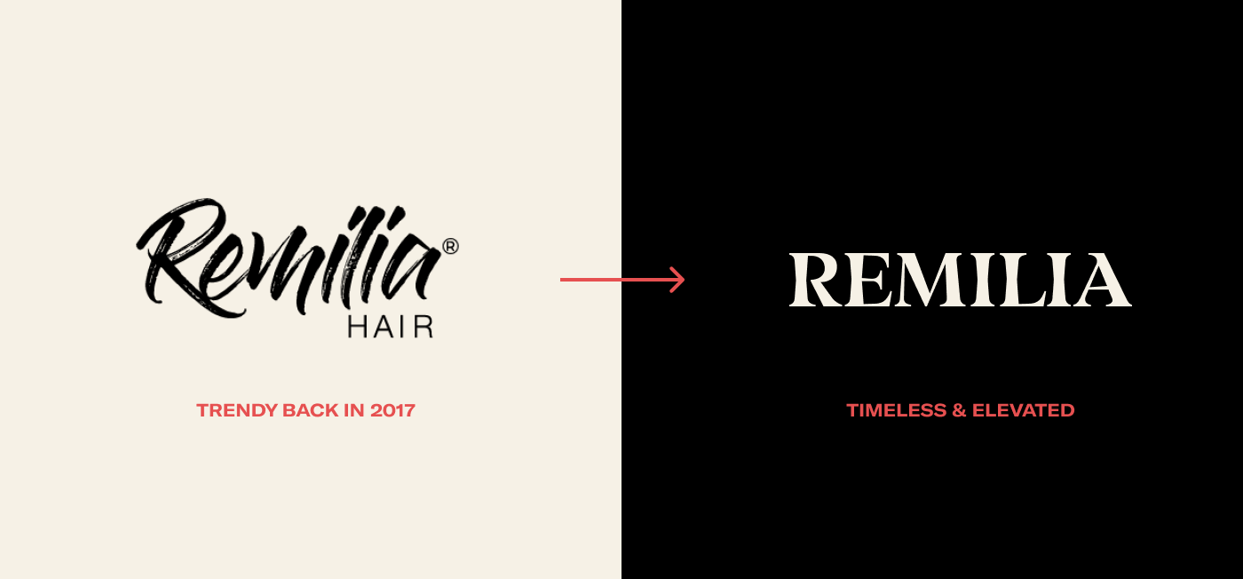
Logotype Before / After
Every founder might want to play it safe at first (totally normal), but real breakthroughs often require embracing the option that initially feels a little too bold.
DESIGN FOR EMOTION
RECOGNITION FOLLOWS

PR box that conveys the new Remilia feeling
A great rebrand isn’t only about looking pretty – it’s about making people feel something while still remembering your name.
For Remilia, we achieved this by creating a wordmark that’s actually readable (imagine that!) yet distinctive, and pairing it with a small dose of art. The new abstract “R” symbol we crafted does triple duty: it looks like a gentle wave, a strand of hair, and a symbol of renewal, all in one graceful stroke. (Yes, we managed to pack all that meaning into a single letter – we’re overachievers.)
The result is a brand mark with both emotional appeal and instant recognizability. It speaks to the product’s essence of softness and self-care while ensuring you don’t confuse Remilia with anyone else on the shelf.

We created additional visual language for the internal part of the packaging to create woow effect while opening a product — water color illustrations with the Ocean pebbles, Sunset lagoon, Wood Canopy and Evening tide. You don’t need words to explain the mood, you just feel it.
→ Visual idea adds variety, making each new product feel distinct while staying within the brand line

Each pack features an unexpected visual pattern inside
MEASURE SUCCESS IN BUSINESS,
NOT JUST AESTHETICS
At the end of the day, a rebrand isn’t just a vanity project – it’s a business strategy. So how did Remilia’s big makeover fare in the real world? In short, it paid off. Post-rebrand, Remilia’s average order value jumped by 69%, and its conversion rate climbed 44%.
Even better, the new elevated look helped land Remilia deals with three major retailers (they came knocking as soon as they saw the chic new branding). Those numbers speak louder than any trendy font or color ever could. The point here is that success is measured by the business growth your new brand identity drives – more sales, more customers, more partners – not just how nice your Instagram feed looks after the redesign.

Booth interior recommendations for Cosmoprof (the biggest beauty expo)

IN SHORT — DON’T LOSE MOMENTUM. CHANGE WHEN IT’S TIME
Rebranding is not for the faint of heart. It’s a roller coaster of introspection, iteration, and the occasional identity crisis. But as Remilia Hair’s story shows, when done right, a bold rebrand can rejuvenate your business and propel it to new heights.
So, the next time you suspect your brand is stuck in a rut or camouflaging itself in a crowded market, take a deep breath and remember these lessons. Embrace a little fear, hold on to what makes you unique, and dare to change the rest – your brand (and your bottom line) will thank you for it.
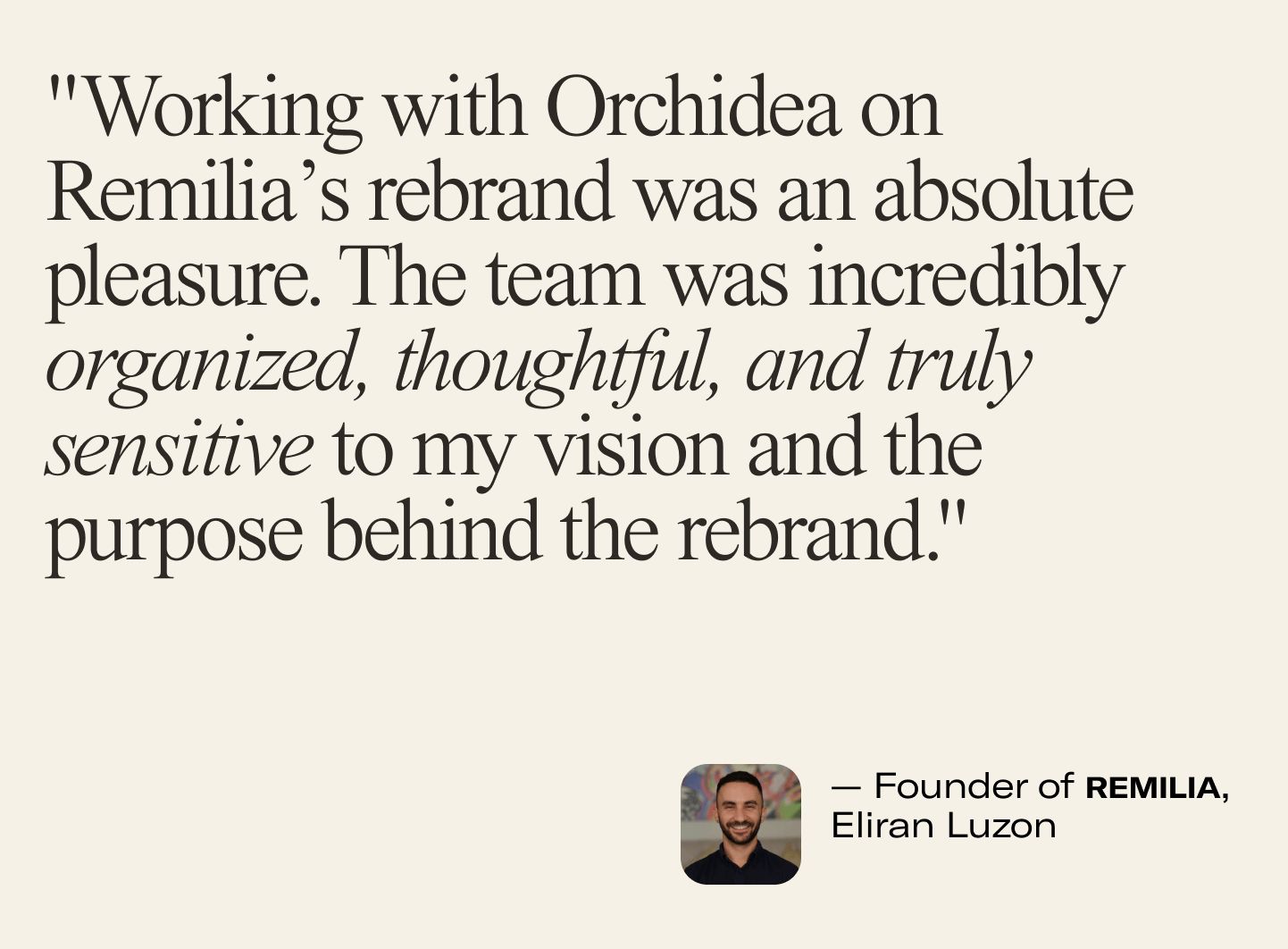
Testimonial from Remilia Founder Eliran Luzon
Building a Wellness or Supplement brand? Book a call — let’s shape a brand that doesn’t just sell, but leads!
If you enjoy our monthly content, we’d love if you could share 💌 it with your friends or mates who might find it interesting. We’d be super grateful!
Cheers, Orchidea team
This article was written by Orchidea Agency, a branding studio specializing in beauty, wellness, health, and supplement brands.


